

Multiregional, Multilingual, Multi-Topic..oh my!
As with any design process, it’s about navigating limitations. But first, we needed to dig into the internal practices of 1400+ contributors to also understand better how the publishers needed the site to operate. In working closely with the core team, we also soon faced a new challenge of making broad changes that would require “buy-in” from the broader team. GV is more of a community structure and the website is the face (and heart) of the organization. As a result we organized a workshop with the broader team of contributors was needed to voice concerns, outline objectives and align on a path forward that could work for everyone. Workshop: Apart from the design challenges of designing any large site, we had work around the limitations of a database with a less than ideal structure.What was needed was to re-architect the information and content strategy altogether to make navigating multiple menu/filtering layers of 1400+ contributors, 167 countries, and 50+ languages a more accessible experience. But in the end, we needed a design solution that could achieve better usability of how users can filter, search and sort such a large mass of content. Working within contraints: So definitely one of the biggest problems to solve was the many layers of complex and lengthy navigation that would simply leave most users running for the emergency exits. One major fix was adapting the language selection options into a compact, collapsible menu (which is actually its own separate page and micro site; GVLingua). Additionally a way to integrate what was once the system to filter region + topic into a smarter, more intuitive top level navigation.
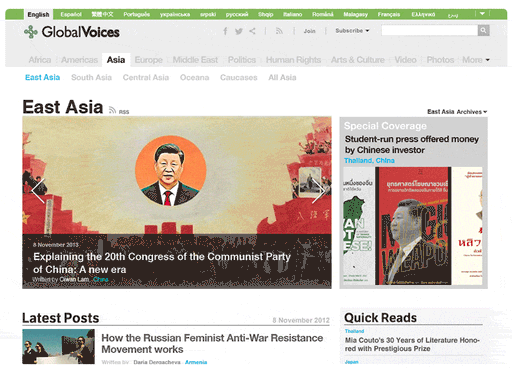
Menu Structure Before
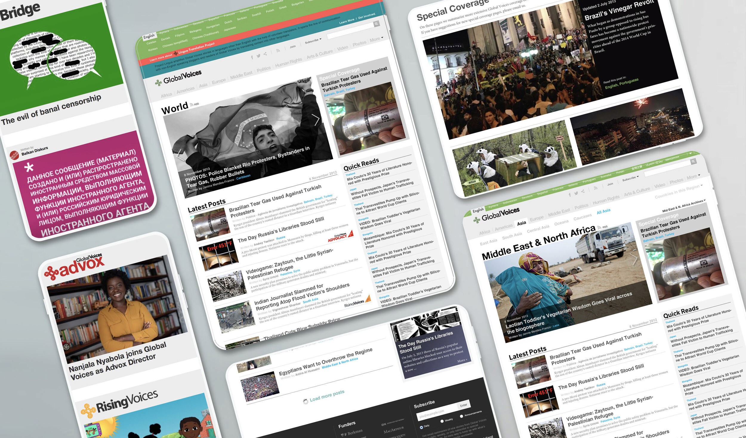
Menu After